Using Colour in Interior Design
Using Colour in Interior Design

Colour can transform a space. Interior design involves selecting acceptable colours, textures, furniture, patterns, accents and more for a home. Before you choose the right interior designer for you, it helps to understand colour theory, so you can work better together on creating the home design you want.
Colour is sometimes split into warm and cool tones. Warm colours like red, orange, and yellow can energize a space and its people. Cool colours like blue, green, and purple promote calm and relaxation.
It’s always best to keep in mind the space's purpose while picking colours for your home.
Warm, exciting tones may be appropriate for a room where active work is being done, like working out or a child’s playroom. Cool tones may be preferred in kitchens, bathrooms, and even office spaces.
Colour has a huge impact on both people and in a room. Use it to create a welcoming, productive, or even calming environment. In this article, we’ll go in-depth on how to use colours in interior design.
What is colour Theory?
The colour wheel inspires colour theory. Visual artists may interact with their viewers by appealing to them to blend colour, but colour theory is the science and art of matching colours.
The colour wheel was created by scientists and artists, including Sir Isaac Newton (the ROYGBIV colours). Colour theory helps artists and designers build a solid basis for their work, and the colour wheel is the foundation of it.
Colour Theory in Interior Design
Understanding colour theory helps with colour harmony in house design. Colours have an important impact on human psychology and emotions. Colours may impact emotions, contribute to the ambiance, and affect how a person feels. Colour schemes are widely used to create distinct ambiances and emotions in the house. Lighter hues produce a peaceful and open vibe while darker colours offer a dramatic statement. Choosing an interior colour scheme may be both stressful and thrilling- but don’t worry, that’s why we’re here to help!
Different colours and their Psychological Effects
Colours inspire emotions, moods, and establish the tone of a room. Yellow and orange are generally connected with love, passion, rage, and joy. Colours like blue and white are connected with serenity and tranquility.
Here are a few examples:
Blue: Blue is a calming hue associated with peacefulness. It is a moderate impact that lowers blood pressure and reduces anxiety. Blue evokes images of the sea and the sky. Differing shades of blue may be used well in a bedroom, or office.

Green: Abundance, tranquility, calm, and rejuvenation are expressed by the colour green. It is a calming hue that may brighten your attitude. It's used to envision nature and is soothing. Try a forest green accent wall- they are becoming increasingly popular in living rooms.
Pink: Pink symbolizes love and compassion. A happy and pleasant mood is created by using pink in living rooms, restrooms,or a young child’s bedroom.
White: White is the colour of innocence, purity, and completeness in both psychology and interior design. White enlarges a room. The appropriate white can make a place seem chic and contemporary.
Yellow: This colour has a lot to do with how it's used in the interior. Yellow may be dull if not utilized sparingly. This colour is regarded as both positive and negative in colour psychology. Yellow rooms may evoke unpleasant emotions.
Where to use each colour in Interior Design
1. The blue colour is best suited for bedrooms and bathrooms
Add pastel blue into your area to soften a corner, select a dramatic blue for a strong regal flair, throw in a brilliant blue for an electrifying blast of colour, or go with a neutral hue for an inviting colour to paint the walls. Blue is also desirable since it acts as a complement to practically any colour.
2. Green colour is best suited for living rooms
Choose greens that are well-balanced with tans and browns for a cozy living area. A huge area rug or wall-to-wall carpeting will look great. Then add white or neutral walls and comfortable living room furniture.
3. Pink colours work wonders in children's rooms
A brighter pink evokes feelings of tenderness, innocence, delicateness, nurturing, and tranquility.

Photo from The Birds Papaya, Pink Bathroom
When talking about colour it’s not just about the walls. Think accents like bedspreads, pillows, lamps, wall art etc. Colour is everywhere from floor to ceiling & everything in between!
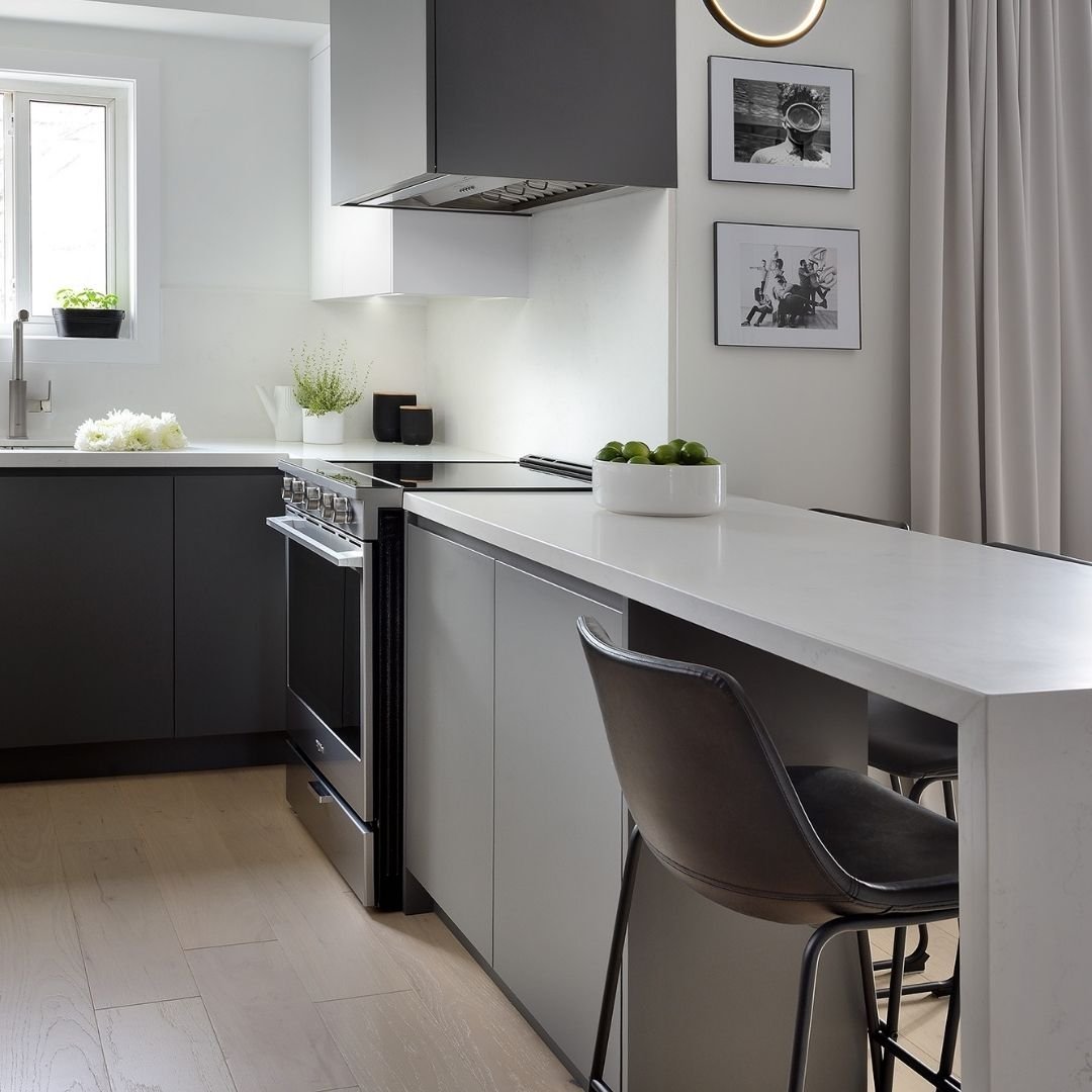
4. White is best used in bathrooms and kitchens
White is the most popular interior hue, particularly in places where people bathe, clean, and eat. White also gives us the feeling of cleanliness and sanitation, which is why we prefer to use it in bathrooms and kitchens.

In a small space, use white on the walls and almost always on the ceilings. White ceilings reflect all light, making rooms look bigger.
5. Yellow can be a cheerful and refreshing colour in a kitchen, study, or even living room
Yellow is a great hue for creating a warm, sunny, and welcoming environment. Although not as popular on the walls in modern design, yellow accents like faux (or real!) lemons in a kitchen, or pillows on a neutral couch can create a fun, fresh and vibrant accent to your kitchen or living room.

Did you ever imagine colours could mean so much? Colour theory is vital to understanding how colours work together in interior design. An interior designer spends a lot of time understanding the colours and their effects. Expertly combining colours in the proper context, and creating the optimal colour palette for each room and place in a house is the first step in making your house your haven.
Looking for help with a redesign, remodel or even home staging? Reach out and say hi! www.ammoderninteriors.com or info@ammoderninteriors.com